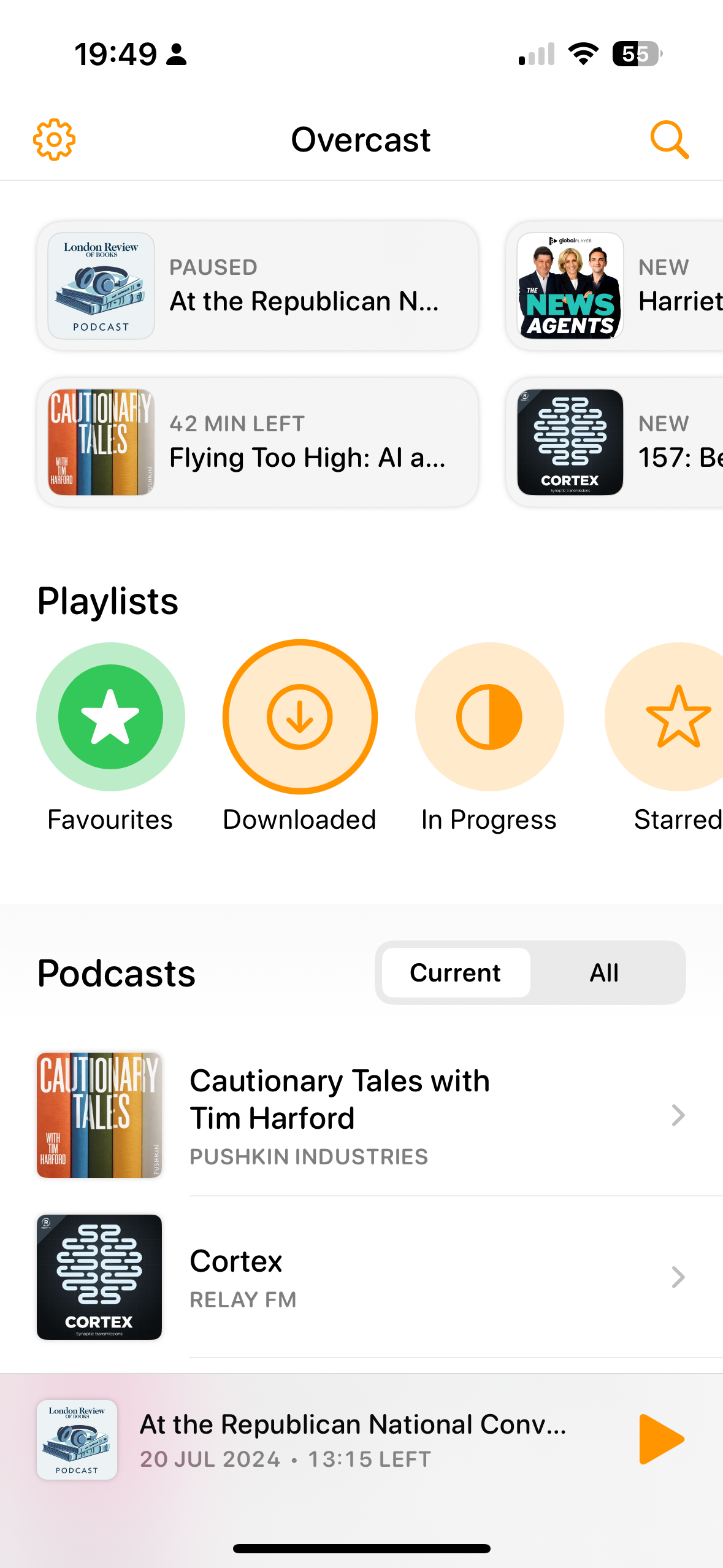
I generally find the UI of the Overcast podcast app over-complex and it seems worse in the new version. There is a grid at the top, then a row of playlists then a column of subscriptions. And none of them quite fit.
*****
Written on
I generally find the UI of the Overcast podcast app over-complex and it seems worse in the new version. There is a grid at the top, then a row of playlists then a column of subscriptions. And none of them quite fit.